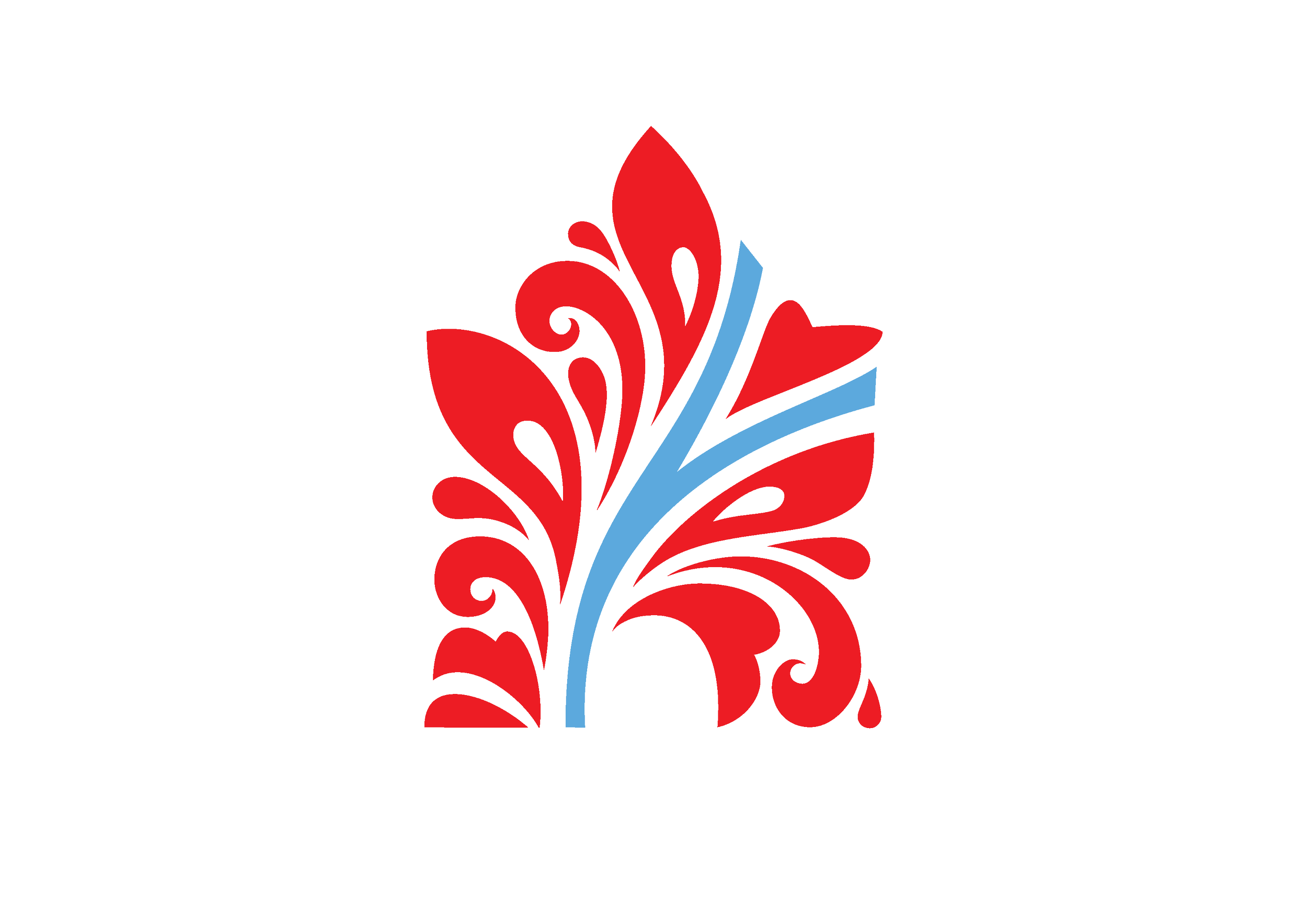
Nizhniy Novgorod

Visual Identity for my hometown.

Nizhniy Novgorod, the fifth largest city in Russia, is often confused with Novgorod. Although the city is one
of the most important historic and cultural center in the country and home to the most famous types
of Russian applied art, it is generally unknown abroad.

In different periods, it has been known as Russia’s Purse, the Capital of Volga River, and the Third Capital. During the Soviet Union era, the city was called Gorky, and it grew as an industrial center and was closed
to foreigners.

Although Nizhniy Novgorod is now striving to be attractive to tourists and investors and to improve its status
as a city accessible to everybody, it seems that officials do not know how to achieve that goal. In their visual communications about Nizhniy Novgorod, they still use the historic symbols and heraldry, and the city uses
the traditional coat of arms as its logo. This tactic commands respect from the residents of Nizhniy Novgorod when it is used internally, but it does nothing to foster outsiders’ recognition of the city’s image.

To enhance the efficiency of visual contacts and to attract attention, they should use modern graphic language. This would allow them to make the necessary generalizations and to devise a constructive, capacious formula from a set of symbols.

I did not attempt to avoid the influence of the Khokhloma style, because Nizhny Novgorod is a center of applied arts, and this Russian wood painting folk art, known for its vivid flower patterns painted in red and gold colors over a black background has always been bought and sold at the city fair.

This historic city is commonly associated with its Kremlin, an important architectural military fortification built in the 16th century. That’s why the sign’s outline is modeled on one of the most famous of the Kremlin’s
12 towers, Dmitrov tower, that stands on Minin square, the central square of the city. One can clearly see from
the Kremlin the junction of the Oka and Volga Rivers. The blue branch in the sign is the symbol of two rivers, and the heart is a symbol of both that junction and the author’s love for the city.

The deer was borrowed from the coat of arms, and the Russian Venus can be seen in the art museum.
The display face and the artwork style were influenced by the work of Tatiana Mavrina, an artist from Nizhny Novgorod.

The project turned out to be a kind of a set of pieces that can be assembled in different ways. We can change the scale, deliberately enlarge ornamental parts of the sign (it can be called Macro-Khokhloma). We can play on a single image or totally deconstruct it.

Previous
Previous

Herbs & Bees